Perceivable
Information and user interface components must be presentable to users in ways they can perceive.
Guideline 1.1: Text Alternatives
Provide text alternatives for any non-text content so that it can be changed into other forms people need, such as large print, braille, speech, symbols or simpler language.
1.1.1: Non-text Content (Level A)
Non-text contents is explained by W3C as: any content that is not a sequence of characters that can be programmatically determined or where the sequence is not expressing something in human language. This includes ASCII Art (which is a pattern of characters), emoticons, leetspeak (which uses character substitution), and images representing text.
Examples:
1. Missing alt attribute.
Correct
The image below has an alt attribute that explains the content of the image.
Wrong
The image below does not have an alt attribute.
2. Decorative image containing alt with non-related text.
Correct
The image below is decorative and should therefore contain an empty alt attribute.

Wrong
The image below is decorative but contains an alt attribute that says "This tag is not necessary".
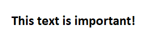
3. Image containing text that is important for the reader.
Correct
The image below contains important text that should be conveyed in the alt attribute.
Wrong
The image below contains important text but the text is not conveyed in the alt attribute as it should be when it is only text in the image. For reference see example given by w3: example.
4. Properly considering HTML emojis as images.
Correct
The HTML emoji will be considered as an image for assistive technologies with proper aria labeling.
😇Wrong
The HTML emoji is not treated as an image, and does not have proper aria labeling/alternative text to provide context for assistive technologies.
😇5. Hiding ASCII art that is purely decorative.
Correct
This ASCII art is given the role of presentation, and will be hidden from assistive technologies as it is purely decorative.
Wrong
This ASCII drawing will still be picked up by assistive technologies and create confusing contexts as screen-readers would read the symbols.
                           |
                         .'|'.
                        /.'|\ \
                        | /|'.|
                         \ |\/
                          \|/
                           `
6. Providing alternative text for ASCII content.
Correct
This ASCII art has a label in order to describe the art for users using assistive technologies.
                            _
                          .'_`--.___   __
                         ( 'o`   - .`.'_ )
                           `-._      `_`./_
                             '/\\    ( .'/ )
                            ,__//`---'`-'_/
                             /-'        '/  VK
Wrong
This ASCII drawing does not have any labeling/alt text to help decipher it for assistive technologies.
                            _
                          .'_`--.___   __
                         ( 'o`   - .`.'_ )
                           `-._      `_`./_
                             '/\\    ( .'/ )
                            ,__//`---'`-'_/
                             /-'        '/  VK
Guideline 1.2: Time-based Media
Provide alternatives for time-based media.
1.2.2: Captions (Prerecorded) (Level A)
Synchronized captions are provided for non-live video.
Example:
1. Caption tracks for videos
Correct
The video has a caption track!
Wrong
This is an example of a video with no caption track!
Guideline 1.3: Adaptable
Create content that can be presented in different ways (for example simpler layout) without losing information or structure.
1.3.1: Info and Relationships (Level A)
Information, structure, and relationships conveyed through presentation can be programmatically determined or are available in text.
Examples:
1. h1-h6 in correct order.
Correct
Throughout the page h1-h3 has already been used in order. Below are the rest of the headings in correct order.
This is h4
This is h5
This is h6
Wrong
Throughout the page h1-h3 has already been used in order. Below are the rest of the headings in incorrect order.
This is h6
This is h4
This is h5
2. Using lists.
Correct
Below is a list using the ol and li elements.
- Write code
- Review code
- Rewrite code
Wrong
Below are three paragraph elements that are direct children of the ol element without any li elements.
1. Write code
2. Review code
3. Rewrite code
3. Proper table markup.
Correct
A table using the th attribute for the headers.
| Time | Monday | Tuesday | Wednesday | Thursday | Friday |
|---|---|---|---|---|---|
| 8:30-9:00 | - | - | - | - | - |
| 9:00-9:30 | - | - | - | - | - |
Wrong
A table using the td attribute for the headers.
| Time | Monday | Tuesday | Wednesday | Thursday | Friday |
| 8:30-9:00 | - | - | - | - | - |
| 9:00-9:30 | - | - | - | - | - |
4. Asterisk to label obligatory forms.
Correct
Below is a form with required fields marked with asterisk and color. The required field includes an aria-describedby attribute that will provide information for assistive technologies like screen readers, considering how an asteriks may be ignored, or not be clear enough as to what it is for.
Wrong
Below is a form with required fields marked with an asterisks but no clarification as to what it means, leaving the user unaware. There is also a missing aria-describedby attribute to clarify for screen readers. Providing no solutions for assistive technologies.
5. Labeling for checkboxes.
Correct
Forms with checkboxes need to be programmatically determinable with proper labels.
Wrong
These form checkboxes lack labels to be able to be programmatically determined.
This example may also flag violates for touch targets considering a label is used for formatting
the checkbox and its touch target.
6. Applying title attribute instead of labels.
Correct
The below input fields have title attributes to describe their purpose that will aid assistive technologies where labels may not be applicable.
Wrong
The below input fields have neither titles or labels to help be programmatically determined.
1.3.2: Meaningful Sequence (Level A)
When the sequence in which content is presented affects its meaning, a correct reading sequence can be programmatically determined.
Examples:
1. Correct order.
Correct
The columns below are in the correct order programmatically.
First
If the second paragraph is positioned before the first programmatically it could potentially result in negative effects on screen readers.
Second
That would cause this part to be read first even though it is the end of the two columns.
Wrong
The columns below are in the wrong order programmatically but utilizes flex-direction: row-reverse to maintain the same structure as the correct way.
First
That would cause this part to be read first even though it is the end of the two columns.
Second
Despite its outward appearance, the second paragraph is actually positioned before the first programmatically, potentially resulting in negative effects on screen readers.
2. White space in the middle of a word.
Correct
This example uses CSS to increase the spacing between the letters in the heading. Using letter spacing through CSS maintain meaningful text sequencing.
WELCOME
Wrong
This example has white spaces within a word to space out the letters in a heading. Screen readers may read each letter individually instead of the word "Welcome."
W E L C O M E
1.3.3: Sensory Characteristics (Level A)
Instructions provided for understanding and operating content do not rely solely on sensory characteristics of components such as shape, color, size, visual location, orientation, or sound.
Example:
1. Navigation using icons.
Correct
Navigation menu that contains icons and text.
Wrong
Navigation menu that contains only icons. The icons are not presented with an alternative text and is therefore solely relying on that the user can visually see and recognize the icons. A house representing "Home", a letter representing "Mail" and a phone representing "Call".
1.3.4: Orientation (Level AA)
Content does not restrict its view and operation to a single display orientation, such as portrait or landscape, unless a specific display orientation is essential.
Example:
Content not showing in certain orientation.
If you are using a computer you can try this with devtools.
Correct
The content inside this box is not affected by orientation.
Wrong
You have the wrong orientation. Try rotating your device!
You are now using the correct orientation.
1.3.5: Identify Input Purpose (AA)
Form autocompletion is a way of easing form completion for users that may struggle with reading, typing,
or those that use assistive technologies in general.
Providing the appropriate labels and titles helps not only users to understand the purpose of the field,
but allows for the autocompletion as a result
of forms being able to be programmatically determined.
Depending on the context of the form, some input types are not available as autocompletions.
There is a list of
Input Attribute Values
that catalogues all of the available autocompletion for input types.
Example:
1. Autocompletion identification.
In order to manually see the affect of correct and wrong, autocompletion needs to be allowed and completed in browser settings first for this context of autocompleting email forms.
Correct
This form input can be programmatically determined and autocompletion can be utilized.
Wrong
This form input does not provide any autocompletion.
Guideline 1.4: Distinguishable
Make it easier for users to see and hear content including separating foreground from background.
1.4.1: Use of Color (Level A)
Color is not used as the only visual means of conveying information, indicating an action, prompting a response, or distinguishing a visual element.
Examples:
1. Link in text.
Correct
The underline helps convey that the link below is in fact a link.
This link is more likely to be visible for people with color-blindness.
Wrong
This link is only a different color from the text to convey that it is a link.
This link might not be visible for people with color-blindness.
2. Color cues in a form.
Correct
The form below has been "posted" without any information in the required fields. The response to this is a red error message stating the issue.
Wrong
The form below has been "posted" without any information in the required fields. The response to this is a to highlight the missing fields.
1.4.3: Contrast Minimum (Level AA)
The visual presentation of text and images of text has a contrast ratio of at least 4.5:1, except for the following:
- Large Text - Large-scale text and images of large-scale text have a contrast ratio of at least 3:1;
- Incidental - Text or images of text that are part of an inactive user interface component, that are pure decoration, that are not visible to anyone, or that are part of a picture that contains significant other visual content, have no contrast requirement.
- Logotypes - Text that is part of a logo or brand name has no contrast requirement.
Large scale text is text with at least 18 point or 14 point bold or font size that would yield equivalent size.
Examples:
1. Normal text.
Correct
The text below has sufficient contrast ratio.
This text has sufficient contrast!
Wrong
The text below does not have sufficient contrast ratio. According to WebAIM's contrast checker it has a contrast of 4.05:1
This text does not have sufficient contrast!
2. Large text.
Correct
The text below has sufficient contrast ratio even though it uses the same color as the insufficient example above.
This text has sufficient contrast!
Wrong
The text below does not have sufficient contrast ratio. According to WebAIM's contrast checker it has a contrast of 1.92:1
This text does not have sufficient contrast!
3. Bold text.
Correct
The text below has sufficient contrast ratio even though it uses the same color as the insufficient example above.
This text also has sufficient contrast because it is bold!
Wrong
The text below does not have sufficient contrast ratio. According to WebAIM's contrast checker it has a contrast of 1.92:1
This text does not have sufficient contrast!
4. Contrasting normal text over a background image.
Correct
Below is an example of a background image having a range of contrast ratios of 6.8:1 on darker colors to 20:1 on lighter colors within the background image for the text overlaying it to be visible.
Wrong
Below is an insufficient contrast ratio of the overlaying text, making it difficult for visual disabilities. A11y checker can be used for checking various font color and sizes on a background image.
5. Contrasting large text over a background image.
Correct
Below is an example of a background image having a range of contrast ratios of 6.8:1 on darker colors to 20:1 on lighter colors within the background image for the text overlaying it to be visible.
Wrong
Below is an insufficient contrast ratio of the overlaying text, making it difficult for visual disabilities. A11y checker can be used for checking various font color and sizes on a background image.
6. Contrasting large bold text over a background image.
Correct
Below is an example of a background image having a range of contrast ratios of 6.8:1 on darker colors to 20:1 on lighter colors within the background image for the text overlaying it to be visible.
Wrong
Below is an insufficient contrast ratio of the overlaying text, making it difficult for visual disabilities. A11y checker can be used for checking various font color and sizes on a background image.
1.4.4: Resize Text (AA)
This criteria ensures dynamic resizing for font sizes and having css measurements of the font size that align and are relative to the other measurements such as viewport or container. Below represents appropriate techniques of fontsizing with percentages, em units, and named font sizes.
Examples:
1. Various font sizing measures.
Correct
Using proper measurements for font sizes allows the text to be resized dynamically with the container.
Here is some font sized at 100%.
Here is some font sized at 1em.
Here is some font size named as "medium".
Wrong
The font has a fixed size, limiting its resizability with the container.
Here is some font sized at 12px.
2. Wrappable resizing text boxes.
Correct
As the page resizes, the boxes are able to wrap and adjust alongside the resize.
100%.
1em.
"medium".
Wrong
These text boxes will dynamically resize the font, but not wrap to fit page resizing.
100%.
100%.
100%.
1.4.6: Contrast Enhanced (Level AAA)
The visual presentation of text and images of text has a contrast ratio of at least 7:1, except for the following:
- Large Text - Large-scale text and images of large-scale text have a contrast ratio of at least 4.5:1;
- Incidental - Text or images of text that are part of an inactive user interface component, that are pure decoration, that are not visible to anyone, or that are part of a picture that contains significant other visual content, have no contrast requirement.
- Logotypes - Text that is part of a logo or brand name has no contrast requirement.
Large scale text is text with at least 18 point or 14 point bold or font size that would yield equivalent size.
Examples:
1. Normal text.
Correct
The text below has sufficient contrast ratio.
This text has sufficient contrast!
Wrong
The text below does not have sufficient contrast ratio. According to WebAIM's contrast checker it has a contrast of 6.33:1
This text does not have sufficient contrast!
2. Large text.
Correct
The text below has sufficient contrast ratio even though it uses the same color as the insufficient example above.
This text has sufficient contrast!
Wrong
The text below does not have sufficient contrast ratio. According to WebAIM's contrast checker it has a contrast of 4.04:1
This text does not have sufficient contrast!
3. Bold text.
Correct
The text below has sufficient contrast ratio even though it uses the same color as the insufficient color from example 1.
This text also has sufficient contrast because it is bold!
Wrong
The text below does not have sufficient contrast ratio. According to WebAIM's contrast checker it has a contrast of 4.04:1
This text does not have sufficient contrast!
4. Contrasting normal text over a background image.
Correct
This overlaying normal text passes with ratios above 9.21:1 with the lightest colors of the background image.
Wrong
The text below does not have sufficient contrast ratio for enhanced contrast guidelines.
5. Contrasting large text over a background image.
Correct
This overlaying normal text passes with ratios above 9.21:1 with the lightest colors of the background image.
Wrong
The text below does not have sufficient contrast ratio for enhanced contrast guidelines. A11y checker can be used for checking various font color and sizes on a background image.
6. Contrasting large bold text over a background image.
Correct
This overlaying normal text passes with ratios above 9.21:1 with the lightest colors of the background image.
Wrong
The text below does not have sufficient contrast ratio for enhanced contrast guidelines. A11y checker can be used for checking various font color and sizes on a background image.
1.4.8: Visual Presentation (AAA)
The intent of this success criterion is to ensure that visually rendered text is presented in such a manner that it can be perceived without its layout interfering with its readability. People with some cognitive, language and learning disabilities and some low vision users cannot perceive the text and/or lose their reading place if the text is presented in a manner that is difficult for them to read.
This criteria also mentions that line lengths of text should not exceed 80 characters. As mentioned by WCAG 2.2 Technique C20 this can be solved by approaching criteria 1.4.4 properly with using relative measures for text. This will allow the character limit to be maintained as well as dynamic.
Examples:
1. Justified Text.
Correct
This is some text that does not have any justification type assigned to it. It is better to pursue this design of not justifying text as it will aid in readability. Justification is often only ever used for the sake of aesthetics, and matching the text content to align with the sides of the container.
Wrong
This is an example paragraph of justified text. By including the justification type, it will produce an uneven block of text, with holes and interrupts throughout the paragraph that can make it more difficult for users to read. The justification type can add spaces between words or characters, in order to fill out space to the edges of the container.
2. Line Spacing.
Correct
This is an example of a paragraph that has default spacing, meaning single space between its lines. In order to ensure understandable text that is easy to follow, the paragraph that is to follow this one requires a spacing of atleast 1.5 times that of the line-height within the paragraph. That means "the spacing from the top of the last line of 1 paragraph is 250% farther from the Top of the first line of the next paragraph" (WCAG SC 1.4.8)
Now this is a start of a new paragraph that will have the proper margining as a result of the text being placed into a new paragraph element.
Wrong
There actually is no css attribute for paragraph height like there is a line-height that affects the lines
within a paragraph element, so this should be an easy mistake to avoid. The problem would arise when adjusting
the margins of the paragraph element, or simply by not manually separating a block of text into different
elements.
This is an example of relying on a breakline element as opposed to creating two seperate paragraph elements to
create space between the paragraphs. This is not good! A paragraph requires 150% of the space that is found
between the general line-height within the paragraphs.